Axelar Docs
Redesigning Documentation for Speed, Clarity, and Developer Efficiency
Overview
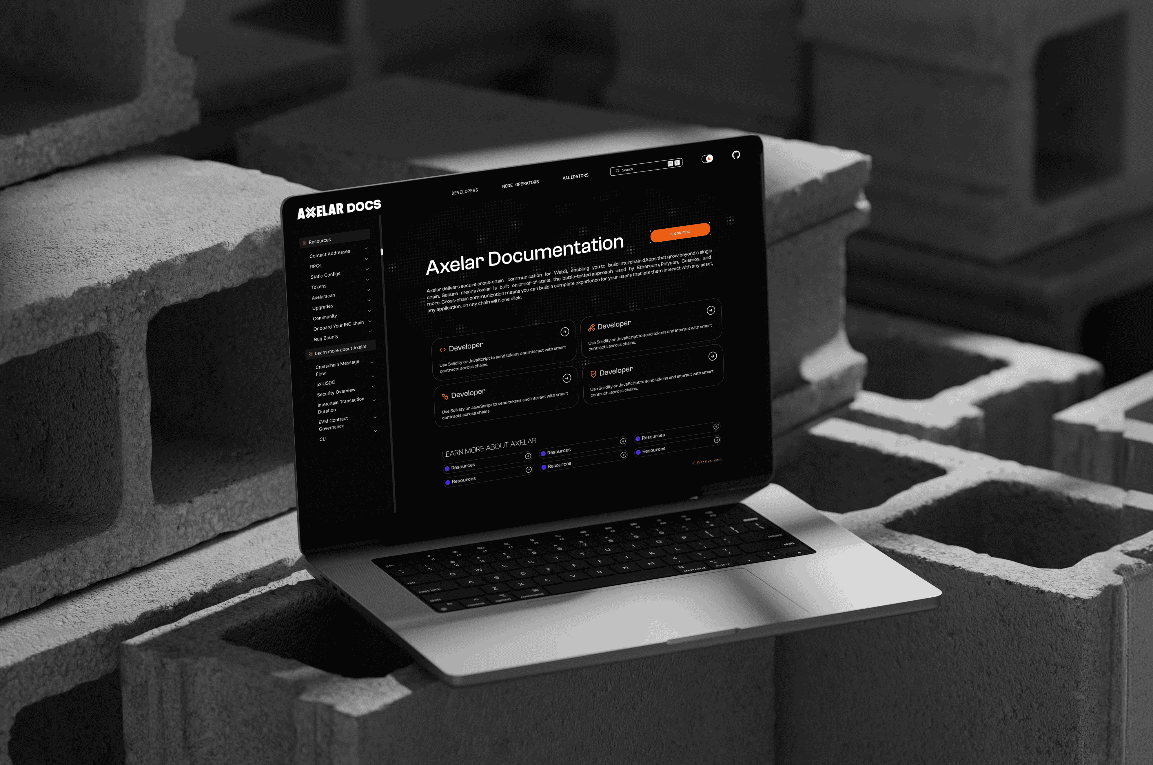
Axelar Docs is a critical resource for developers building cross-chain applications using Axelar's interoperability infrastructure.
However, as the ecosystem evolved, the documentation struggled to keep up leading to fragmented navigation, outdated content, and inefficient workflows.
The goal was to redesign the documentation experience into a clear, scalable, and developer-first system that enables faster discovery and better usability.

Project Scope
The Challenge
The existing documentation suffered from:


Developers often struggled to find the right resources, leading to frustration and wasted time.
What We Were Really Solving
This wasn't just a UI problem, it was an ecosystem problem.

Reduce time-to-discovery

Eliminate confusion in documentation

Build trust through consistency

Create a scalable documentation system
Core Problems & Solutions
Guiding principles that shaped a faster, clearer, and more scalable documentation experience.
Navigation Complexity
Introduced intuitive categorization and predictive search for faster discovery
Redundant Content
Established a single source of truth with structured content hierarchy
Visual Inconsistency
Built a cohesive design system aligned with Axelar branding
User Pain Points
Developers interacting with the existing documentation often found themselves stuck in a frustrating loop: searching, second-guessing, and starting over.
Common feedback reflected a clear breakdown in experience:
"Why is it so hard to find what I need?"
"Which version should I trust?"
"I just give up."
Users frequently encountered:
- Dead-end navigation, paths that led nowhere or required restarting the search
- Duplicate and conflicting information, making it difficult to identify accurate resources
- Unclear content hierarchy, forcing users to scan multiple sections to find what they needed
As a result, even simple tasks became time-consuming, reducing efficiency and eroding trust in the documentation.
Our Approach
We followed a structured, research-driven process:

Discover
- Platform evaluation
- Competitive analysis
Define
- Personas
- User stories
- Product hypotheses
Build
- Wireframes → UI
- Design system
- Custom components
Deliver
- Documentation
- Developer-ready handoff
Competitive Insights
We analyzed leading documentation platforms:

Ethereum Docs
- 1. Strong hierarchy and structure
- 2. Weak onboarding for beginners

Polygon Docs
- 1. Clean UI and navigation
- 2. Redundant and overlapping content
Design Principles
Guiding principles that shaped a faster, clearer, and more scalable documentation experience.

Clarity First
Every interaction should reduce cognitive load

Structured Navigation
Users should always know where they are

Consistency at Scale
Design system ensures uniform experience

Developer Efficiency
Focus on speed, accessibility, and usability
Final Thought
When designed with clarity and structure, it becomes a powerful tool that enables developers to move faster, build confidently, and trust the system.
Complex docs shouldn't slow developers down.
We design systems that make information faster, clearer, and scalable.